The world of advertising and branding is a complex one, and we mere mortals can sometimes get lost in translation. Designers seem to have a deep well of genius they tap into when they come up with new marketing schemes and collateral. However, human as we are, everyone makes mistakes. Each minute detail must be carefully placed or the entire thing will turn out wrong. A single misplaced icon or, in this case, an inappropriate font could spell disaster. Check out these design fails that could have used a triple check before having gone public.
(h/t)
1. Can’t say this sounds appealing…
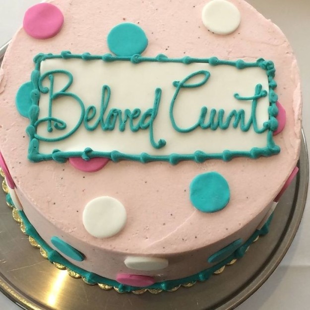
2. Birthday cake gone wrong:
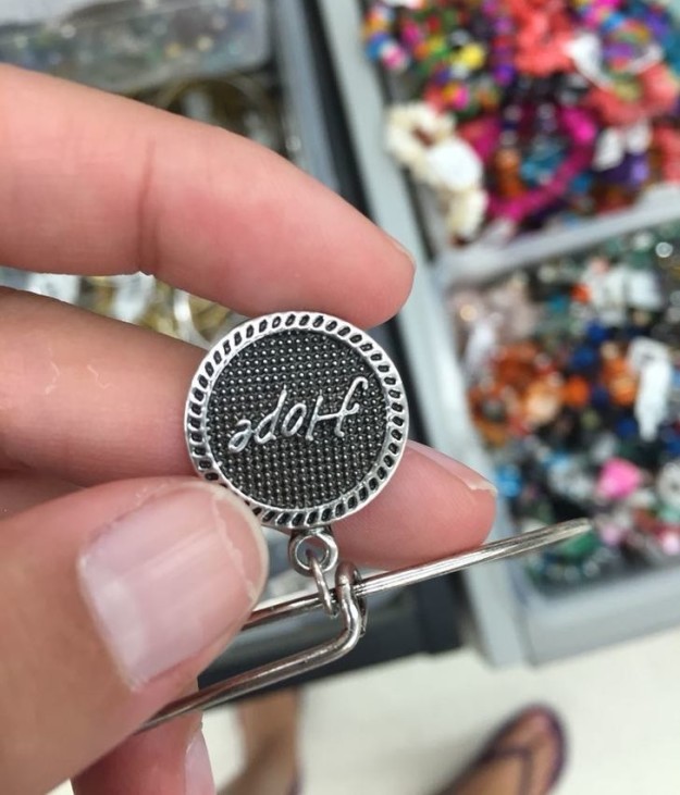
3. Honest mistake?

4. Or not?
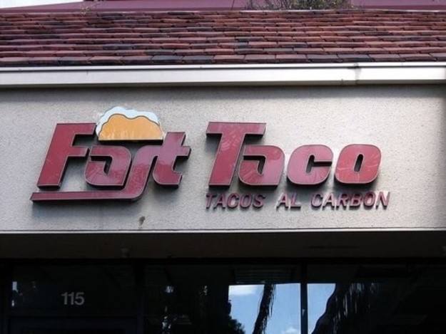
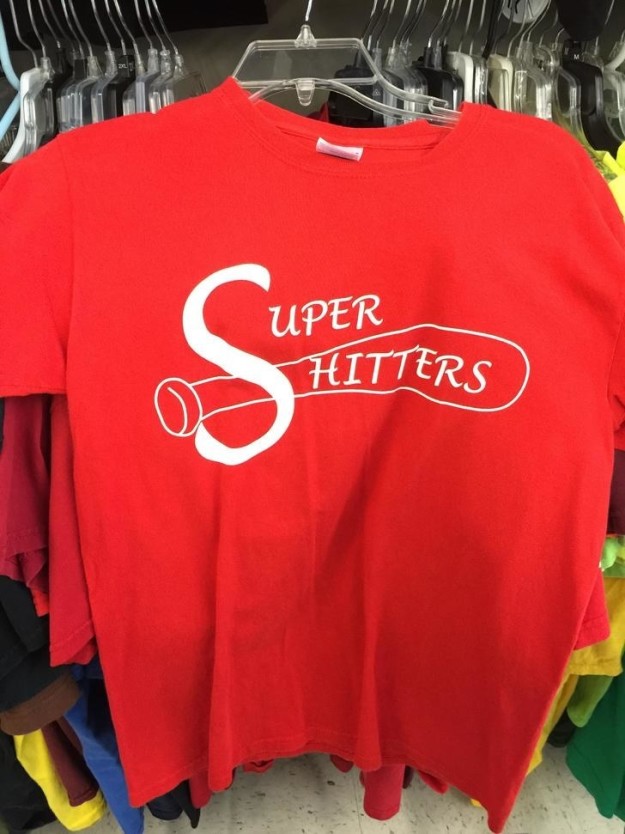
5. This is one hit of a t-shirt.
6. How progressive!

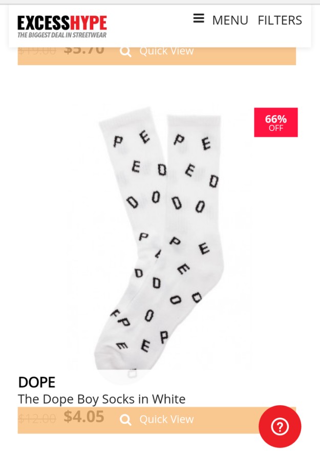
7. Dope or pedo?
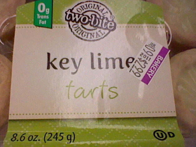
8. Flavored farts, anyone?